Patty & Bun – Celebrating a Chef’s Craft
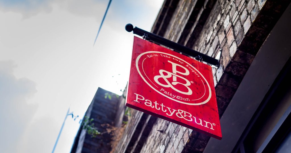
The logo device and logotype design for Patty & Bun is a standout example of branding that fuses personality, playfulness, and precision — all essential traits for a modern food brand seeking to carve out a distinct identity in a saturated market.
Bold simplicity with character. At first glance, the logotype appears deceptively simple — clean, confident letterforms — but beneath that minimalism lies a typographic treatment full of charm and subtle edge. It’s bold without being brash, immediately legible yet brimming with personality, much like the burgers it represents. The letterforms have a hand-crafted, organic feel, which evokes the artisanal, lovingly-made ethos behind the brand’s food.
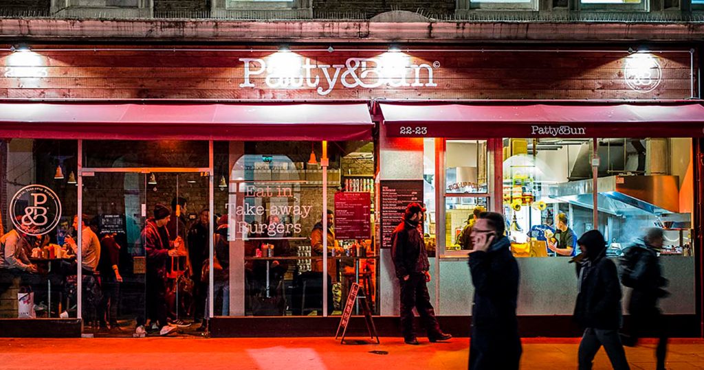
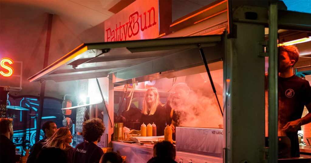
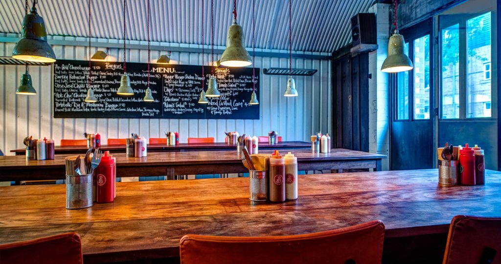
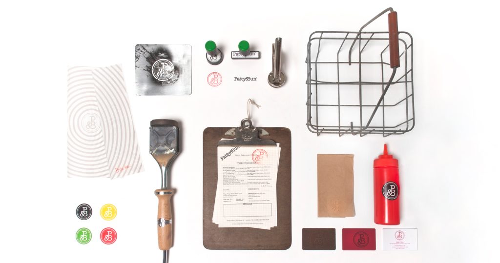
The logo captures the energetic, slightly rebellious spirit of Patty & Bun. There’s a rhythm to the way the letters flow and interact, suggesting motion and creativity. It feels as much at home on brown kraft takeaway packaging as it does emblazoned on a neon-lit storefront or a t-shirt sleeve — a mark of versatile, future-proof design.
The design strikes a delicate balance between urban grit and warmth. The logo’s visual tone fits seamlessly with Patty & Bun’s positioning as a cool, independent burger joint that appeals to both the design-conscious foodie and the casual eater. It’s stylish without being pretentious, authentic without relying on nostalgia.
Rather than relying on heavy-handed iconography or cliché burger graphics, the logotype carries the weight of the brand — a confident move that speaks to the strength of the design. It’s recognisable in isolation and sets a consistent tone across menus, signage, and digital presence.
Unlike many fast-casual brand logos that lean into fleeting trends, the design has longevity. It doesn’t scream for attention — it commands it through well-judged restraint and identity coherence. The identity is more than just a logo — it’s a distillation of the brand’s philosophy. It visually conveys quality, originality, and a love of craft — the same qualities that go into every burger served..
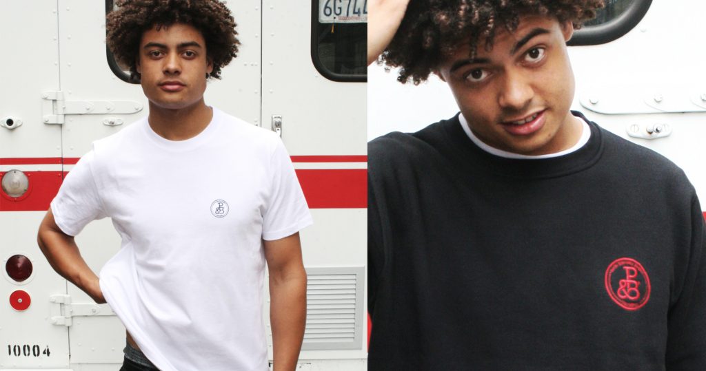
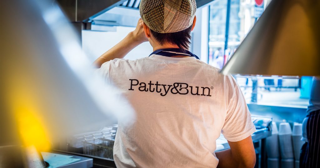
“It feels as much at home on brown kraft takeaway packaging as it does emblazoned on a neon-lit storefront or a t-shirt sleeve — a mark of versatile, future-proof design.”